Choosing the background and card colour
Your invitation has two areas with their own colour. Background is everything around the card. Card is the area your text and photo sit on.
Picking a colour
- At the top of the builder, click the Background or Card field. It shows the current colour and its colour code.
- A small panel opens right below the field. Click a colour dot or the colour wheel, or type a colour code (see Using the colour picker and pipette).
- The card changes straight away. Click anywhere outside the panel to close it.
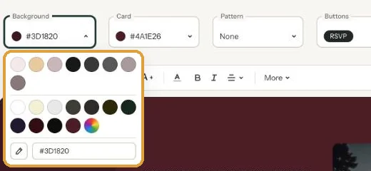
The colour is saved immediately. Don’t like it? Just pick another.
Keeping it readable
What matters most is the contrast between your text and the card colour. Dark text on a light card is the easiest to read, even on a phone in bright sunlight. If you go for a dark card, make the text light (Editing and formatting text).
The background can be bolder, because there’s no text on it. A colour taken from your photo as the background, with a light card on top, is a safe choice.
Fancy something more than a plain colour? Add a pattern: Adding a pattern.
Next step: Using the colour picker and pipette
Last updated: November 11, 2026
- Designing your invitation: the basics
- Choosing a layout
- Choosing the background and card colour
- Using the colour picker and pipette
- Editing and formatting text
- Replacing the example text with your own details
- A new look in seconds with Redesign
- Undoing changes
- Moving and aligning text
- Showing or hiding text frames
- Adding a pattern
- Adding a link to your text
- Customising a ready-made design
- Using keyboard shortcuts